Today marks the first major update to Realtime Trains since August 2013. This has been under development for three years, and marks the first stage in a series of major upgrades being made to the platform.
We’ve been working towards this day for the last three years which at times felt like it would never arrive. My thanks go out to the group of testers who have been providing feedback on the new theming, layout and usage for the last year. Alongside all these developments, we have continued to work in the background with moving RTT and continuing to collect berth offsets and improve our geographical databases amongst other improvements
Changes
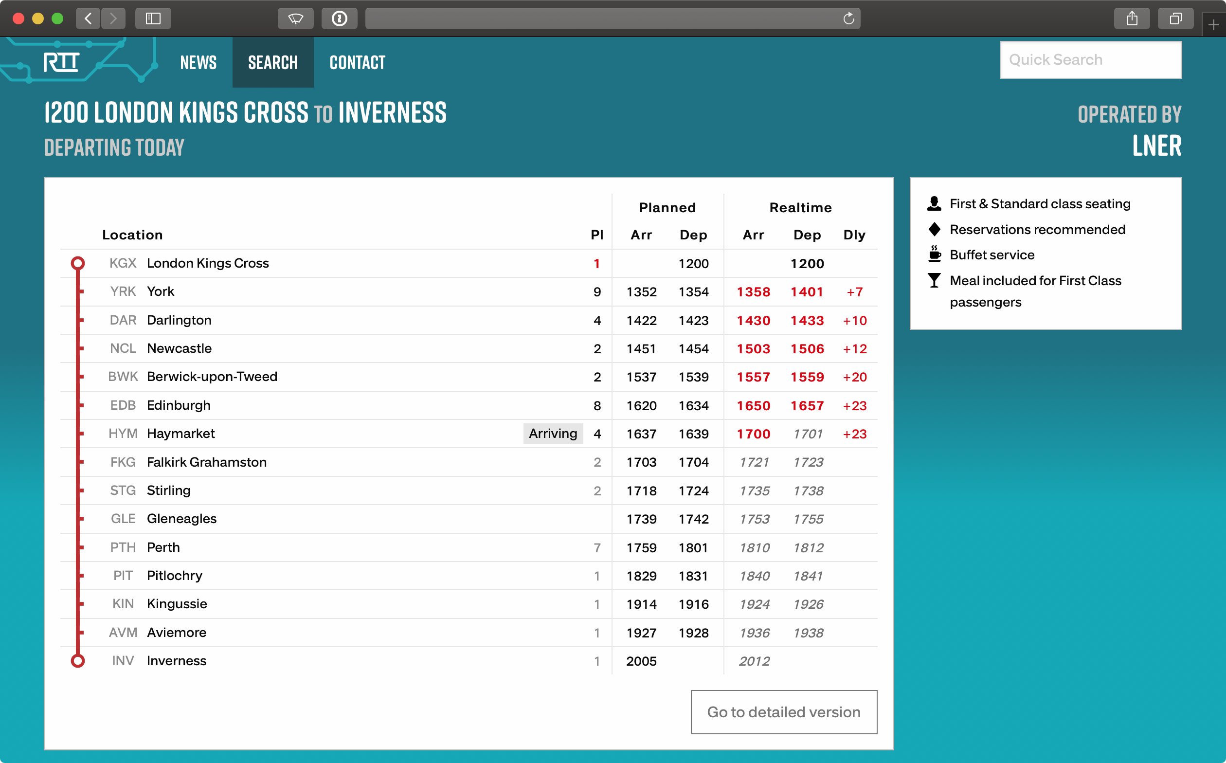
The first thing you’ll notice is the new colours and branding. A vast amount of work has gone into reworking the entire website using modern technical and design standards, catching up with some of the changes over the last six years. “Evolutionary, not revolutionary” has been the ethos behind this new design and I hope that you will all agree.

Simple mode has received a few changes with the intention of making it easier to use the site. If you’re looking for trains, you can now search for other locations, or revise your filtering, from the location search pages. On the train information pages, three letter station codes are now shown against every calling point to help power users to more quickly identify their stops. In a takeaway from European railways, delays will now only show if they are not on time, and as signed number values - an early train will be negative, a late will show positive.
Following a recent discussion on Twitter, we have also changed how departure times are displayed. Times will be rounded up to the nearest minute if the train departs within 15 seconds of the higher minute (e.g. a train leaving at 10:47:48 will round to 10:48 whereas 10:47:42 will not.)
The primary rationale behind this is to reduce confusion for trains that leave ‘on time’ as many services will close doors 30 seconds before departure, and the previous rounding down led to many trains showing that they were consistently departing early which was not necessarily true. We’ll keep monitoring this one, if you have any feedback on this particular change then please let us know.

Detailed mode has seen the most changes. The search menu has been reordered following substantial feedback over the last few years, with better grouping being applied. Date/time filtering is now grouped together as opposed to the slightly more chaotic order previously. To make it easier to follow with larger screens now available on desktop, the search menu will collapse into a vertical menu on wider screens. A version closer to the previous is available on the remainder.
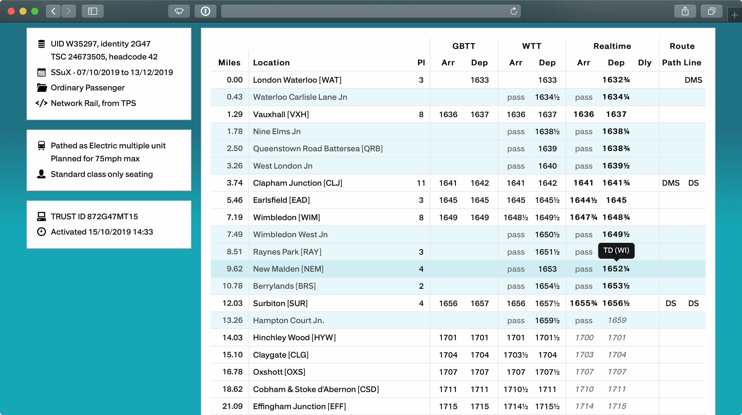
Similar reformatting to make better use of screen space, and making space for features planned in the future, is on the train pages. We’re now using icons to better highlight train metadata, such as identifiers, catering and reservation availability, and upstream systems references. Better colour coding is now being used to indicate whether a value is planned or forecast, or the actual: bold type was previously used in most places, but anything timing or line code that isn’t a reported value is now shown in grey. We’ll also now highlight any train that has been obfuscated in the Network Rail data feeds.
Allowance columns have been removed, and their contents moved to subtitles within the location boxes. The line and path columns have also been swapped over to better reflect what they mean: the path column reflects the route taken to the location, and the line column is the one taken upon departure. Both of these will now be visible on mobile mode, with the latter being in grey and blue outlined boxes respectively.
The change to delays on the simple mode has been transferred over to the new detailed mode, so you won’t see RT anymore, with the intention of making variance more evident.
A relatively unknown feature from the previous version was the ability to see the source of realtime reports or forecasts, so we’ve made it easier to find this out - simply tap or roll your mouse over any time in the realtime column. You can also use this on the location pages for cancellations to find out the reason without having to look at the service.
Other changes
In a series of minor changes, we’ve added a new contact page. Over the last few years, there have been a lot of questions sent to us and the popular ones have been added to the FAQ. One notable question that is frequently received surrounds the meaning of the line codes seen across the network: there isn’t any easy way to answer this in a simple question and answer format but there is a workstream ongoing to answer this in hopefully a useful manner - more on that in the future.
There are also improvements to the information about our data feeds making our pull API feed more accessible, and provide information about the other services we offer. There is, however, currently a review over the external data feeds we offer and their continued viability.
A new status page is now available giving information about our current view of the data platforms we use. This is a result of a number of recent data feed outages, and is intended to be more transparent as to why we may be showing the limited data available banner. We’ll be extending the data shown on this page before the end of the month with information about the current status of all Train Describer areas in the country.
Useful features
There are a number of useful features on Realtime Trains that are rarely used, primarily in relation to the Quick Search box found on every page. The system will search by default using ‘simple’ mode unless you are either on a page of the detailed site.
- Search for any location by typing in its name, three letter CRS code or TIPLOC code1
- Filter location searches by a future or past calling point, by adding ’to X’ or ‘from X’ to the end of your search, e.g. ‘KGX to PBO’
- Search for a train by its headcode/train identity
There are two new options we’ve added to this version of Realtime Trains:
- You can force a detailed search on any page, by ending your query with the word ‘detailed’, e.g. ‘Corrour detailed’
- You can now add ‘yesterday’ when searching for a headcode, e.g. ‘1A97 yesterday’. We’ll be adding support for tomorrow soon.
Feedback
As ever, if you have any feedback on the changes then please email us or send us a message on Twitter or on Facebook.
-
TIPLOC codes are alpha-numeric codes of between four and seven characters length. ↩︎
